Key answer
A RAG-alert dashboard shows each finance KPI against its threshold as Red, Amber, or Green, with an AI-written narrative that explains the movement. You build it by picking the few KPIs that matter, wiring the data, setting thresholds, adding the AI explanation, and scheduling the refresh.
A RAG-alert dashboard shows each finance KPI against its threshold as Red, Amber, or Green, with an AI-written narrative that explains the movement. You build it by picking the few KPIs that matter, wiring the data, setting thresholds, adding the AI explanation, and scheduling the refresh. One note before we start: RAG here means Red, Amber, Green, not Retrieval-Augmented Generation. Same letters, different idea.
Why a status signal beats a wall of numbers#
A static monthly report makes leaders hunt for the problem. A RAG dashboard points straight at it.
Static report vs live RAG dashboard
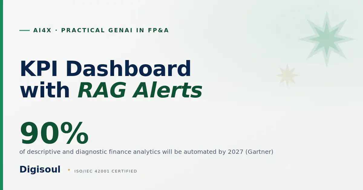
The direction of travel is clear. Gartner expects 90% of descriptive and diagnostic analytics in finance to be automated by 2027. A dashboard that flags status and explains itself is the practical face of that shift.
of descriptive and diagnostic analytics in finance will be fully automated by 2027
Build it in five steps#
The hard part is choosing the few KPIs that matter; the rest is wiring.
Build it in five steps
Pick five to seven KPIs, wire the data, set thresholds with finance, add the AI narrative, then schedule the refresh. For the operating model this dashboard reports into, see the GenAI FP&A operating model.
What the dashboard shows#
Each tile reads against its own threshold, and the colour tells the leader where to look first. Refresh the data to watch new readings flip the statuses.
A live RAG dashboard
Red, Amber, Green is deliberately simple: cash days red means act today, gross margin amber means watch, revenue green means hold. The numbers are illustrative; the discipline is real.
Where AI helps#
Where AI helps
AI writes the narrative, surfaces the driver, and re-runs the explanation on each refresh. You keep the KPIs and the thresholds. The variance logic behind the narrative is detailed in How to Run Variance Analysis with AI.
Ship one on your own data#
Practical GenAI in FP&A ships a Power BI dashboard with RAG alerts and an AI narrative as one of three production artifacts. You leave with a dashboard your leaders open daily.
Key takeaways
- RAG here means Red, Amber, Green status, not Retrieval-Augmented Generation.
- Pick 5 to 7 KPIs that drive the decision, not 40 that decorate the page.
- Set thresholds with finance; let AI write the narrative that explains each movement.
- Schedule the refresh and the alert so the dashboard runs without you.
Questions, answered
What does RAG mean on a finance dashboard?
How many KPIs should a finance dashboard show?
What does the AI actually do here?
Which tool should I build it in?
Dr. Ahmed El-Shamy
Co-founder, CEO and Dean of Education, Digisoul
Dr. Ahmed El-Shamy is Co-founder, CEO and Dean of Education at Digisoul. He has more than a decade across AI, fraud risk, and FP&A, and teaches Practical GenAI in FP&A bilingually across MENA, the GCC, and Africa, governed by Digisoul's ISO/IEC 42001:2023-certified AI Management System. Read the leadership profile.
Sources
- Gartner, Autonomous Finance predictions: by 2027, 90% of descriptive and diagnostic analytics in finance will be automated. https://www.gartner.com/en/finance/trends/autonomous-finance-predictions
- Practical GenAI in FP&A (Power BI dashboard with RAG alerts is artifact 3). https://digisoul.io/ai4x/genai-in-fpa/
AI Agent · Built on Claude · Operated on Zoho One